
Why Logos Are Getting Boring
Working with designers has taught me a few things.
They’re good at choosing colors
To go fast, they copy-paste their own designs
They aren’t good at copy-pasting their own designs without making errors
So perhaps it isn’t a surprise that the quality of logos throughout the marketing world is falling through the floor. They’re being stripped down for parts and are losing their personality like never before.
Visual Identity
I’m no designer. So when I hear visual identity I think about the people who are at work wearing white trainers and black socks. So when I hear visual identity I have no idea what you are talking about.
So let’s cover it here. A brand’s visual identity isn’t just its logo. It includes colors, fonts, website designs, and even the style of images used in marketing. It pushes what the whole company means.
And while for small businesses, a logo and a couple of brand colors might be enough. Large corporations maintain entire brand manuals dictating how every element should look across websites, social media, packaging, and advertising.
Simplify
Logos are changing in a battle for simplification. Everybody is doing it, with reason.
So here is what is going on.
Instant Recognition in an Overcrowded Market
Americans see thousands of ads per day. Double what they saw in 2007 and five times what they saw in the 1970s.
The human brain filters out most of this noise. A simpler logo stands out because it’s easier to recognize and remember. In a split second, customers should be able to identify the brand, whether it’s a billboard, a mobile app icon, or a tiny browser tab logo.
A Stronger Emotional Connection
Trust in a brand is often visual. People feel more comfortable with things they recognize instantly. Studies show that over 50% of consumers spend more with brands they have an emotional connection with. A clean, well-defined brand identity reinforces that trust.
Consistency Across Multiple Platforms
Logos aren’t just appearing on giant billboards anymore. They need to work as icons on your phone, inside app interfaces, and as profile pictures on social media.
A logo has to scale well. Companies avoid hard to read text or a complex interplay of images, because they don’t work as a 32-pixel app icon. The aim is a simple logo that maintains clarity across size and resolution.
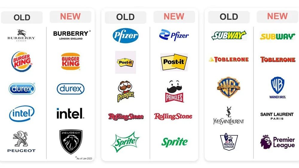
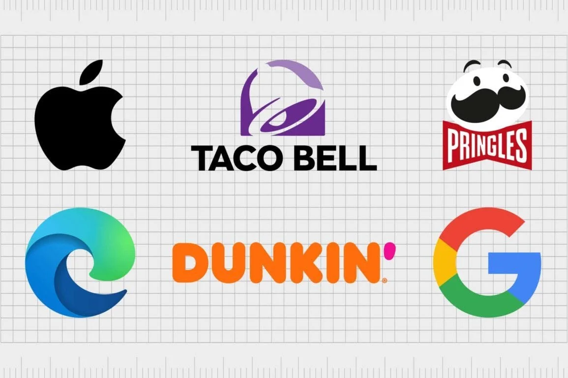
Simplified Branding
It’s all the rage to have a minimalist logo. If any given logo has unnecessary complexity or cursive text, expect it to be changed in short order.
Pinterest & Airbnb
Moved from cursive logos to cleaner fonts and added distinct icons to reinforce brand identity.

Uber & Klarna
Shifted to sleeker, sans-serif typefaces.

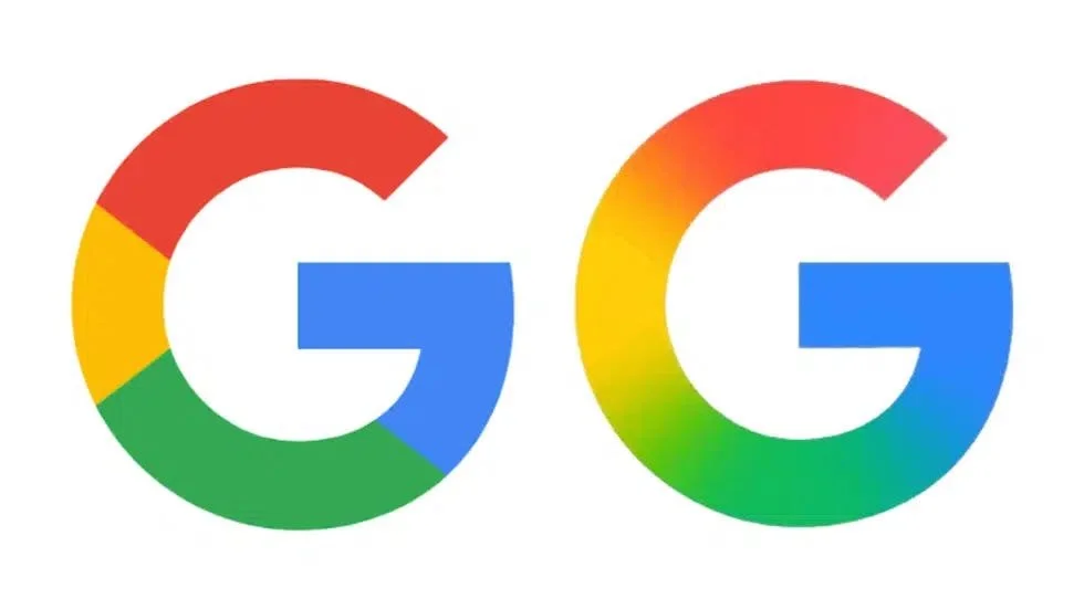
Dropped its old four-color G for a gradient version.
Coca-Cola
While its script logo remains, its marketing materials and packaging have become significantly more minimal over the years.

Even luxury brands have started simplifying. Balenciaga, Burberry, and Yves Saint Laurent all switched to basic sans-serif fonts, often making their logos indistinguishable from one another.
The Downsides of Oversimplification
There’s a fine line between clean and generic. When too many brands adopt the same stripped-down look, they start to lose their uniqueness and actually damage their brand.
A prime example? The luxury fashion industry. Balmain, Balenciaga, Burberry, and Berluti all now use nearly identical, bold sans-serif wordmarks. The result? Homogenization. If you swapped their logos, most consumers wouldn’t notice.
Premium brands do not feel premium if they all have the same fonts and look. They need to do better.
Best Practices for Simplifying Visual Identity
I’m not against simplification, because not all simplification is bad. Some simplifications enhance a brand’s recognition rather than draining it of personality.
The key? Balance.
Here are some best practices for getting that visual identity right.
Mobile-First
More internet traffic happens on mobile devices than desktops. That means a logo needs to be clear and recognizable on small screens.
Planning for small devices has the happy side-effect that large devices will also be easier to use.

Distinct Icons
Pinterest and Airbnb added symbols to their branding, which helps them stand out. Some brands (like Google) use the first letter of their name for icons, covering branding and avoiding a difficult to read brand name.
Avoid Overly Generic Fonts
Sans-serif fonts are popular, but not all are created equal. Brands should customize typography to retain some uniqueness.

Ferrari’s logo shouldn’t look like HP, dispite the link between the two.
Leave Room for Evolution
A simplified visual identity should adapt to future changes in the company’s focus. A highly detailed logo locks a company into a specific aesthetic, while a cleaner design allows for flexibility.
Where Do We Go from Here?
The simplification trend isn’t going away anytime soon. As branding shifts towards digital, companies will continue optimizing logos for tiny screens, quick recognition, and maximum memorability.
The best brands will find ways to retain distinctiveness rather than blending into the sea of geometric sans-serif sameness. Simplicity doesn’t have to mean boring. The brands that master this balance will be the ones that stand out in an increasingly cluttered world.
Conclusion
Stripping down a logo is great for recognition and usability, but brands should be careful not to simplify themselves into oblivion.
Nobody wants to be in a world where every company looks identical. The unique look of brands then becomes a brand in itself, and we might be in a recursive metabranding situation. And nobody wants that.